About The Project
A cohesive brand thrives on clarity, consistency, and intention. For this project, I developed a comprehensive Brand Guidelines document that brings every visual and verbal element into alignment. It outlines the core identity—logo usage, colour palette, typography, imagery, and tone—while offering practical direction for applying the brand across digital and print touchpoints. The result is a clear, accessible reference that empowers the client to show up with confidence and maintain a unified presence as they grow.
Identifying the Client's Brand Personality
A brand’s personality is the collection of values that identify way the brand wants to connect with the public. It’s like a set of personality traits. Every choice made needs to reflect these values to share the story of the brand from the use of colour, typography and imagery.
Whole Bean is honest and sincere. They want their customers to feel like part of a community that is inclusive to all; a place that is friendly while they drink a cup of quality sustainable java. The colors, typography and imagery should give a sense of the fun, friendly, warm, inclusive community that Whole Bean is going for.
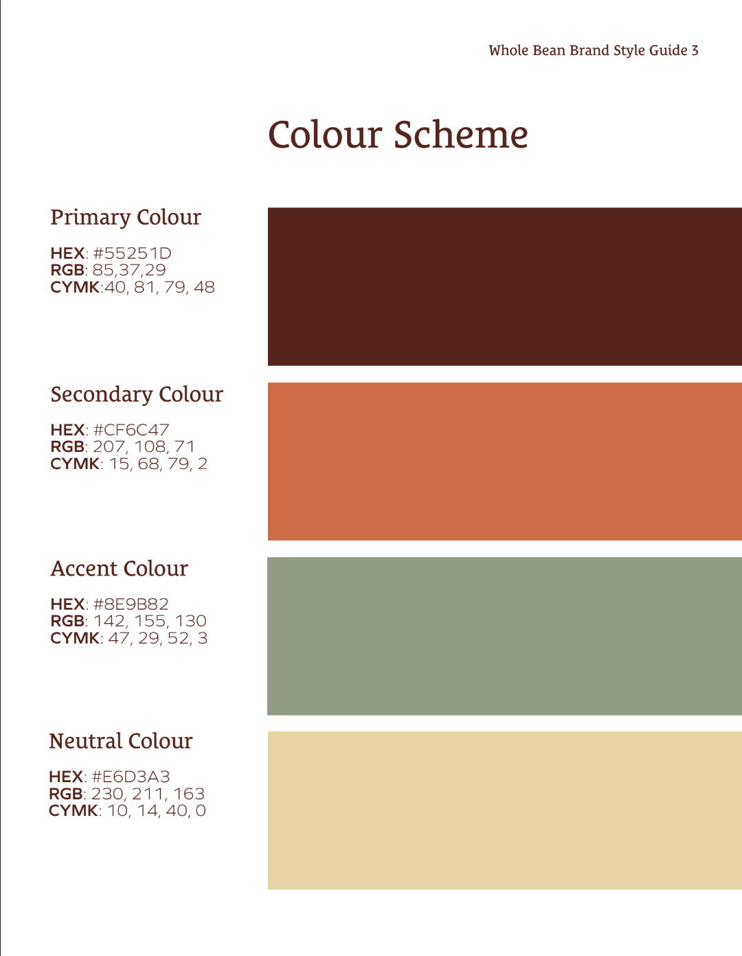
To convey this, we chose a pallette in a warm brown that, not only is the colour of coffee, but represents honesty & comfort. Next is an earthy green to symbolize Whole Bean’s commit to sustainable practices, and a soft coral to represent fun & creativity.
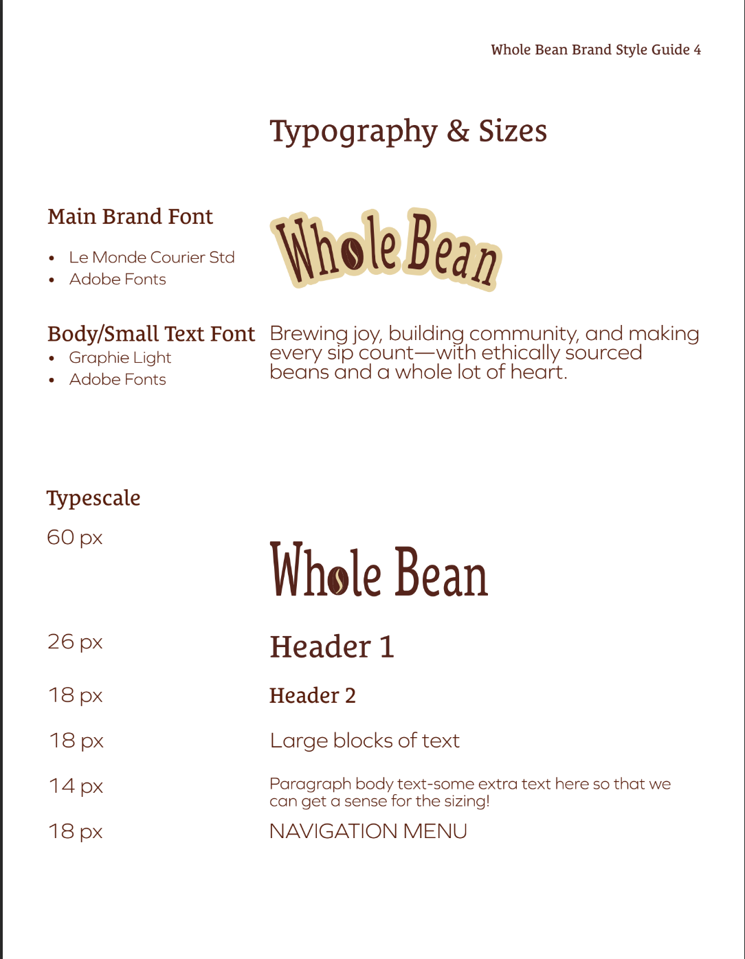
We chose a serif font as the primary typeface for its roots in tradition, respect & comfort, with a sans-serif for its clean modern feel.
Designing the Right Logo
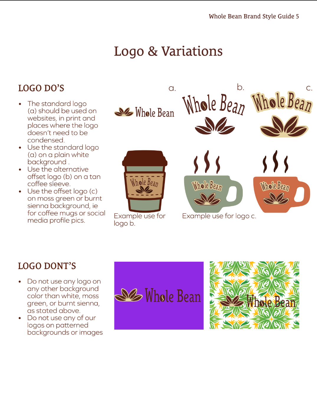
A logo should capture a brand’s personality and doesn’t necessarily need to be literal.
While here we did use coffee beans in the logo, the cluster of beans represents the community they want to build.
In the guide, we provided guidance on logo do’s and don’ts for effective use to maintain the brand’s values. There are also a couple variations of the logo and wordmark to ensure it features well across the approved colours by adding an offset to maintain contrast.
Iconography
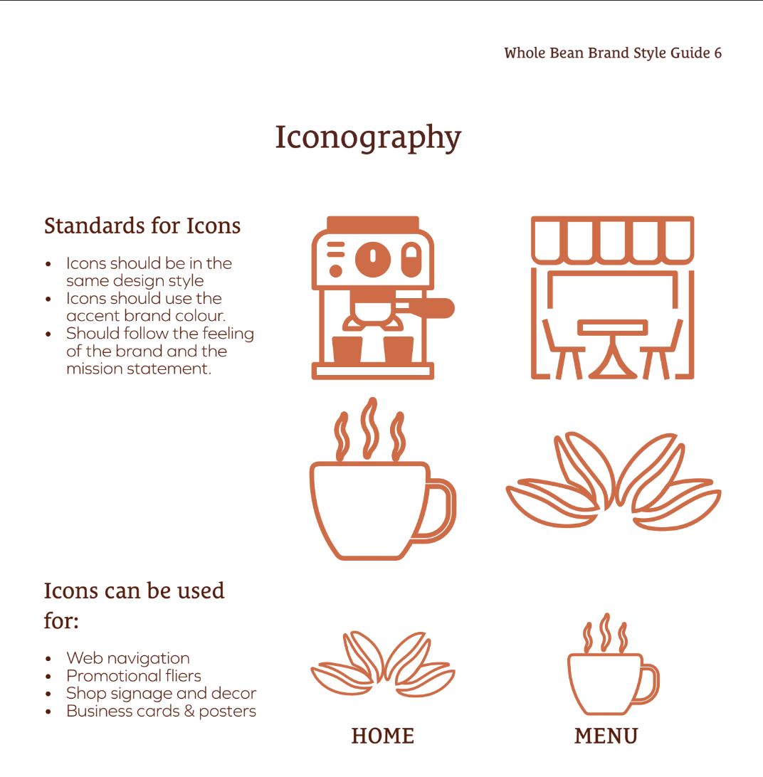
It is very important to ensure that all icons being used follow the same look & feel that was used in the colour scheme and logo. There should be consistency in the style, colour and thickness of lines.
The style guide conveys the standards for icons and how they should be used.
The Outcome
At first I resisted this project because I wanted to just get into the work and build my portfolio website but I struggled with designing my website because I learned that what I might like as an individual doesn’t necessarily convey the values and message that I want my brand to convey. I went through many designs before I finally realized that having a brand style guide taught me how important it is to have a cohesive brand and why. A lot more thought and psychology goes into choosing the right look & feel for a brand than anyone might realize and it’s important to fully develop this in the beginning to avoid frustrations by all parties.
About The Project
A cohesive brand thrives on clarity, consistency, and intention. For this project, I developed a comprehensive Brand Guidelines document that brings every visual and verbal element into alignment. It outlines the core identity—logo usage, colour palette, typography, imagery, and tone—while offering practical direction for applying the brand across digital and print touchpoints. The result is a clear, accessible reference that empowers the client to show up with confidence and maintain a unified presence as they grow.
Identifying the Client's Brand Personality
A brand’s personality is the collection of values that identify way the brand wants to connect with the public. It’s like a set of personality traits. Every choice made needs to reflect these values to share the story of the brand from the use of colour, typography and imagery.
Whole Bean is honest and sincere. They want their customers to feel like part of a community that is inclusive to all; a place that is friendly while they drink a cup of quality sustainable java. The colors, typography and imagery should give a sense of the fun, friendly, warm, inclusive community that Whole Bean is going for.
To convey this, we chose a pallette in a warm brown that, not only is the colour of coffee, but represents honesty & comfort. Next is an earthy green to symbolize Whole Bean’s commit to sustainable practices, and a soft coral to represent fun & creativity.
We chose a serif font as the primary typeface for its roots in tradition, respect & comfort, with a sans-serif for its clean modern feel.
Designing the Right Logo
A logo should capture a brand’s personality and doesn’t necessarily need to be literal.
While here we did use coffee beans in the logo, the cluster of beans represents the community they want to build.
In the guide, we provided guidance on logo do’s and don’ts for effective use to maintain the brand’s values. There are also a couple variations of the logo and wordmark to ensure it features well across the approved colours by adding an offset to maintain contrast.
Iconography
It is very important to ensure that all icons being used follow the same look & feel that was used in the colour scheme and logo. There should be consistency in the style, colour and thickness of lines.
The style guide conveys the standards for icons and how they should be used.
The Outcome
At first I resisted this project because I wanted to just get into the work and build my portfolio website but I struggled with designing my website because I learned that what I might like as an individual doesn’t necessarily convey the values and message that I want my brand to convey. I went through many designs before I finally realized that having a brand style guide taught me how important it is to have a cohesive brand and why. A lot more thought and psychology goes into choosing the right look & feel for a brand than anyone might realize and it’s important to fully develop this in the beginning to avoid frustrations by all parties.